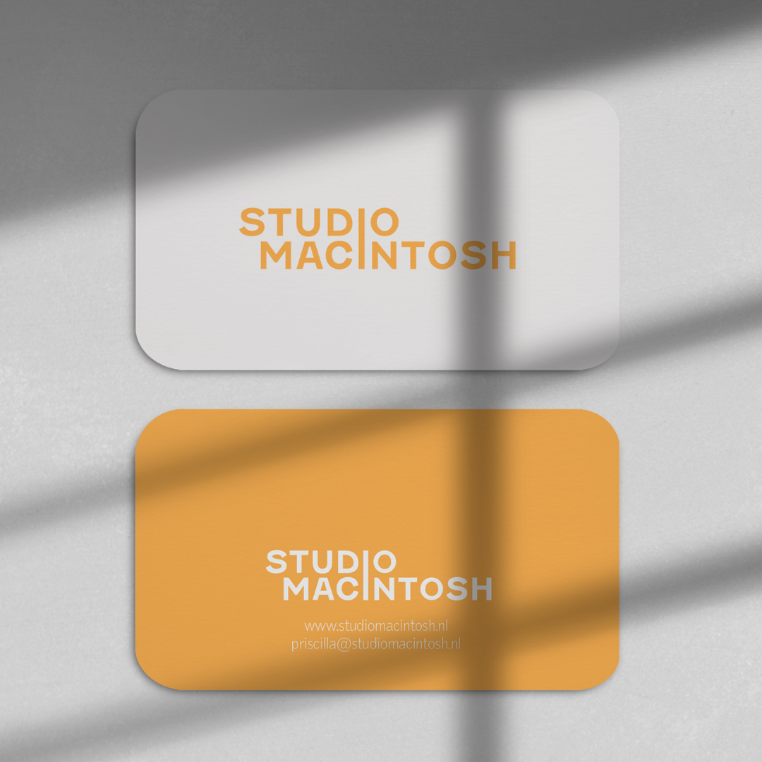
Studio macintosh
Rebranding & visual identity
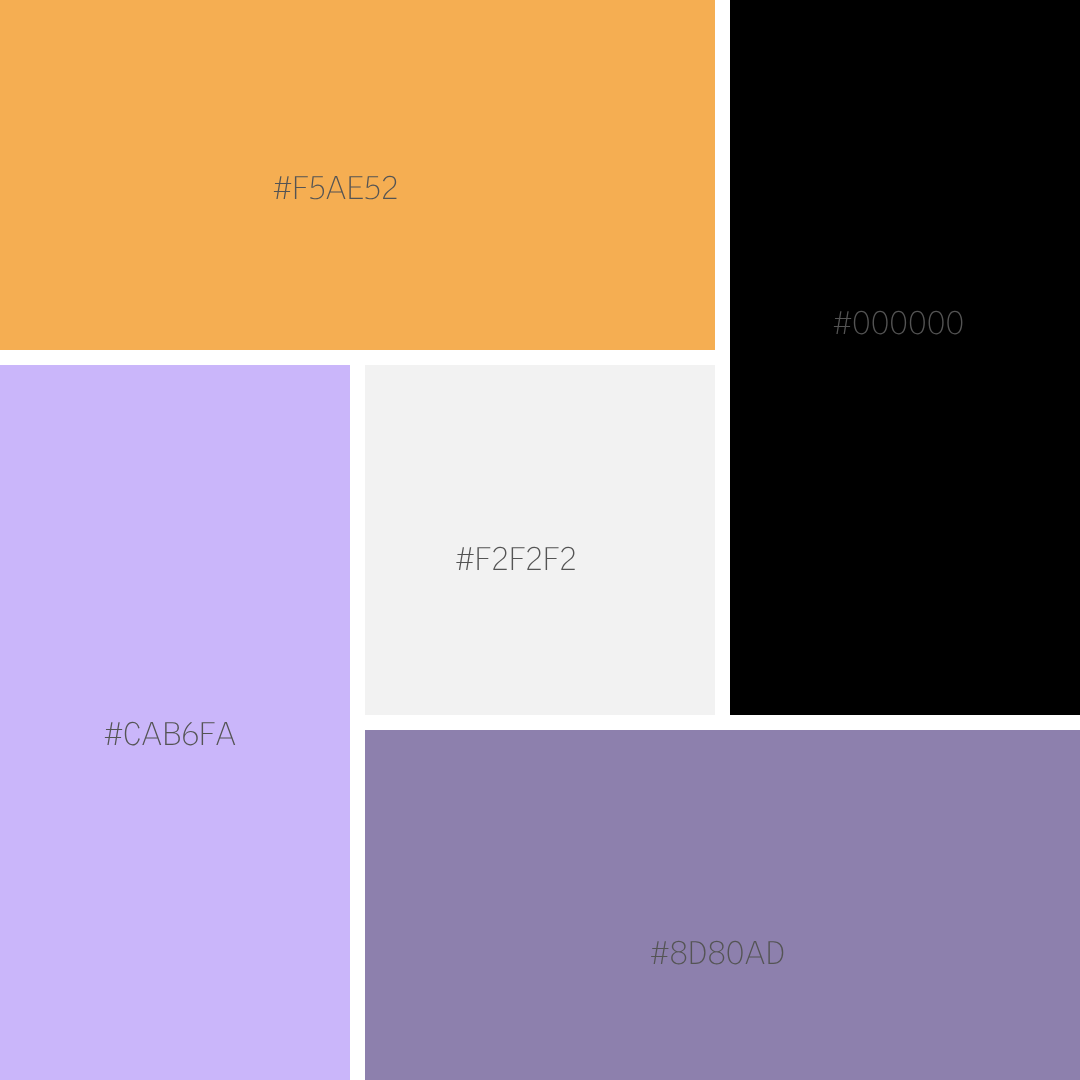
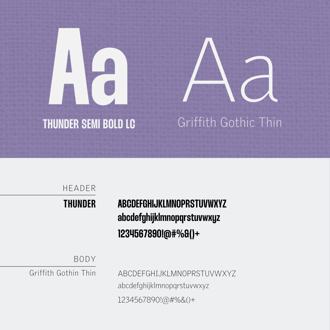
Full brand identity (logo, typography, colour palette, visual language)
Brand guidelines
Studio Macintosh is an interdisciplinary practice whose work spans the fields of art, society, (pop) culture, events and education. This was my first independent branding project and an opportunity to give this practice an identity that appears both innovative and professional.
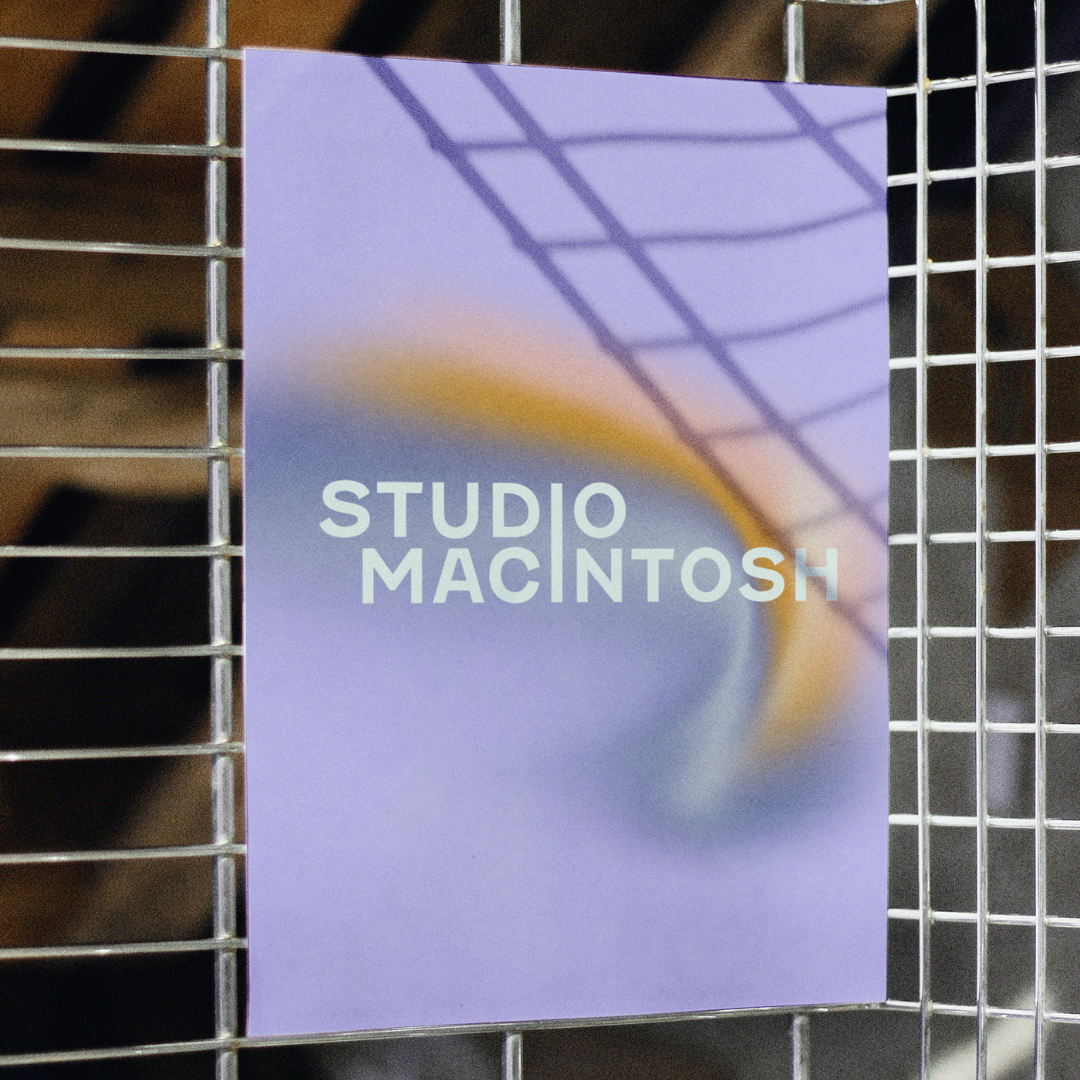
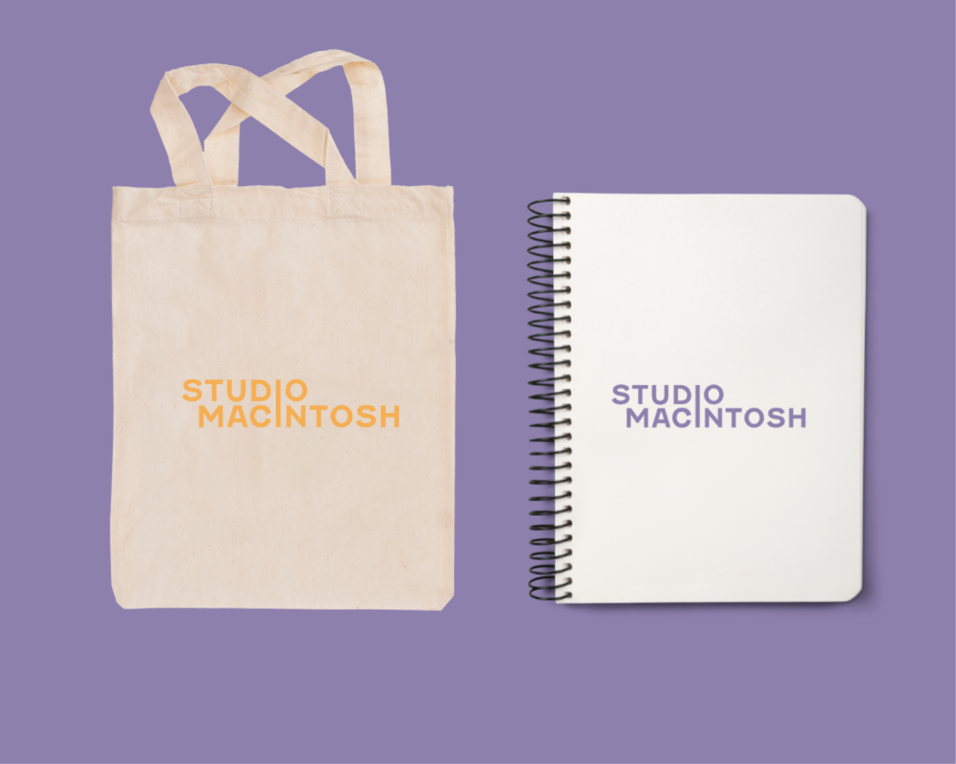
Through research and close collaboration with Priscilla Macintosh, I developed a wordmark logo, typographic designs and a versatile, playful colour palette. The standout detail of the logo: the ‘i’ in ‘Studio’ and the ‘i’ in ‘Macintosh’ merge into a single letterform, linking the two words into a single, unified symbol. The result is a clear, timeless identity that reflects the studio’s broad scope whilst giving it a distinct, memorable signature.