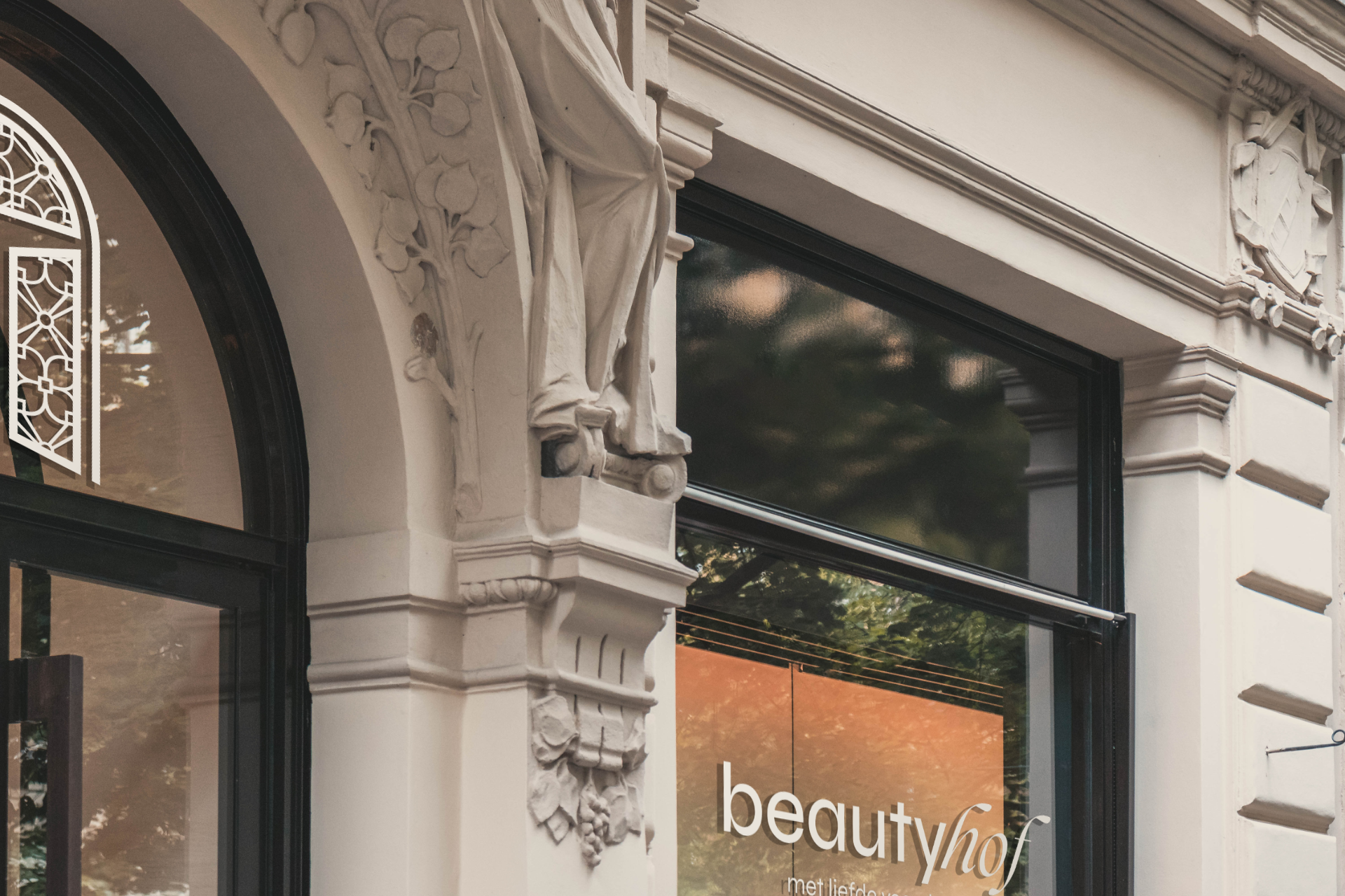
Beautyhof
Art direction & conceptualization
Art direction (branding concept)
Typography exploration
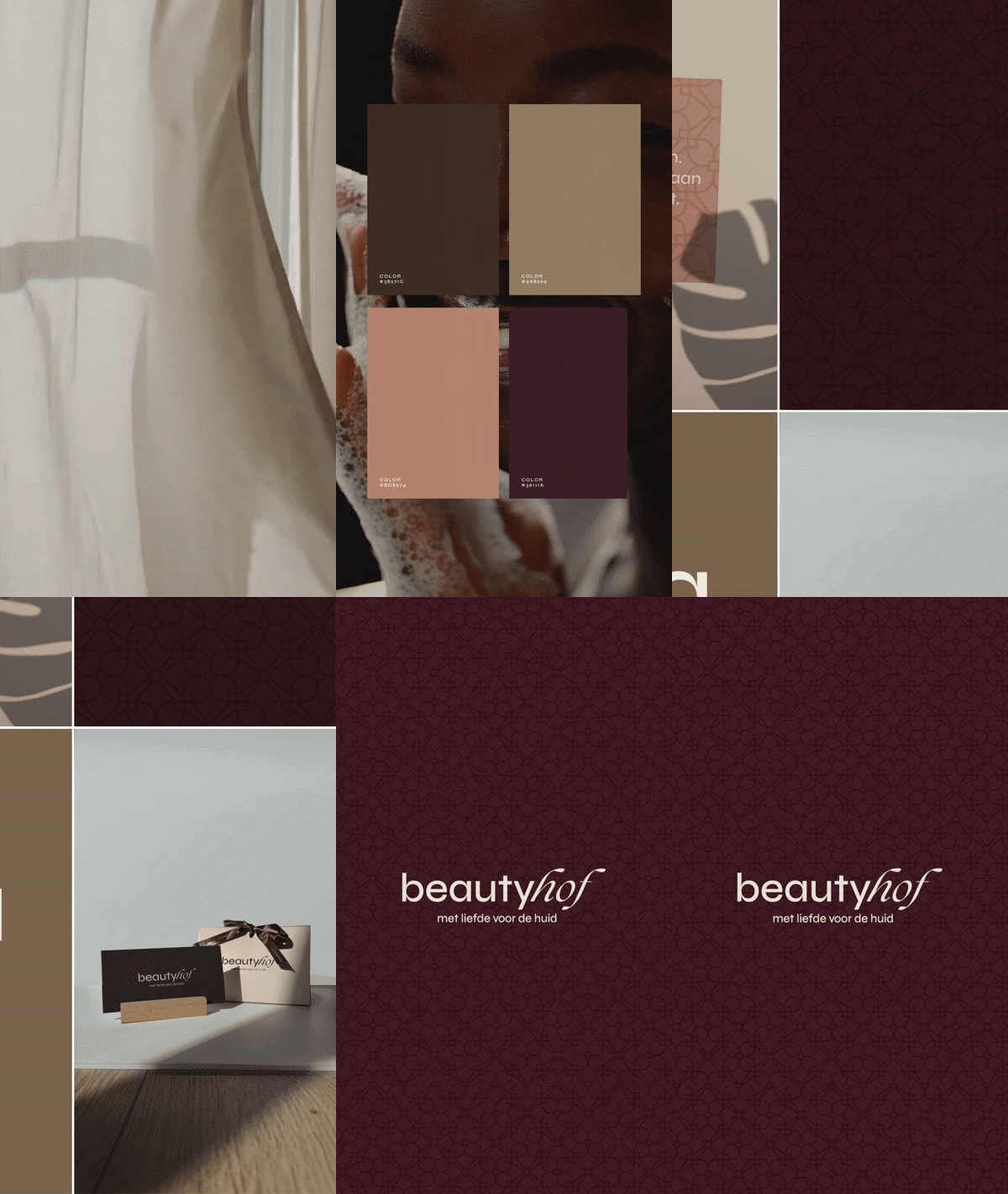
Colour palette
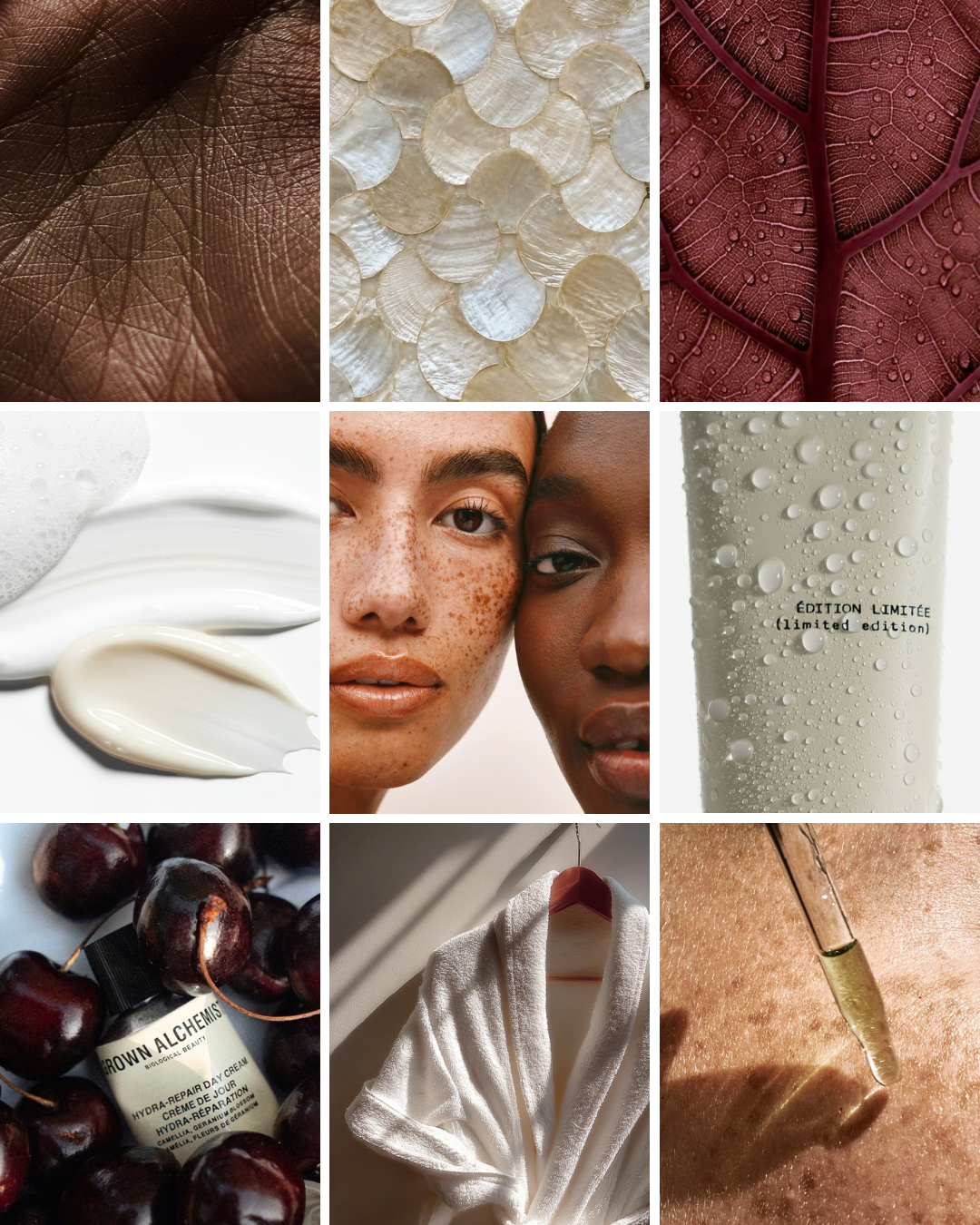
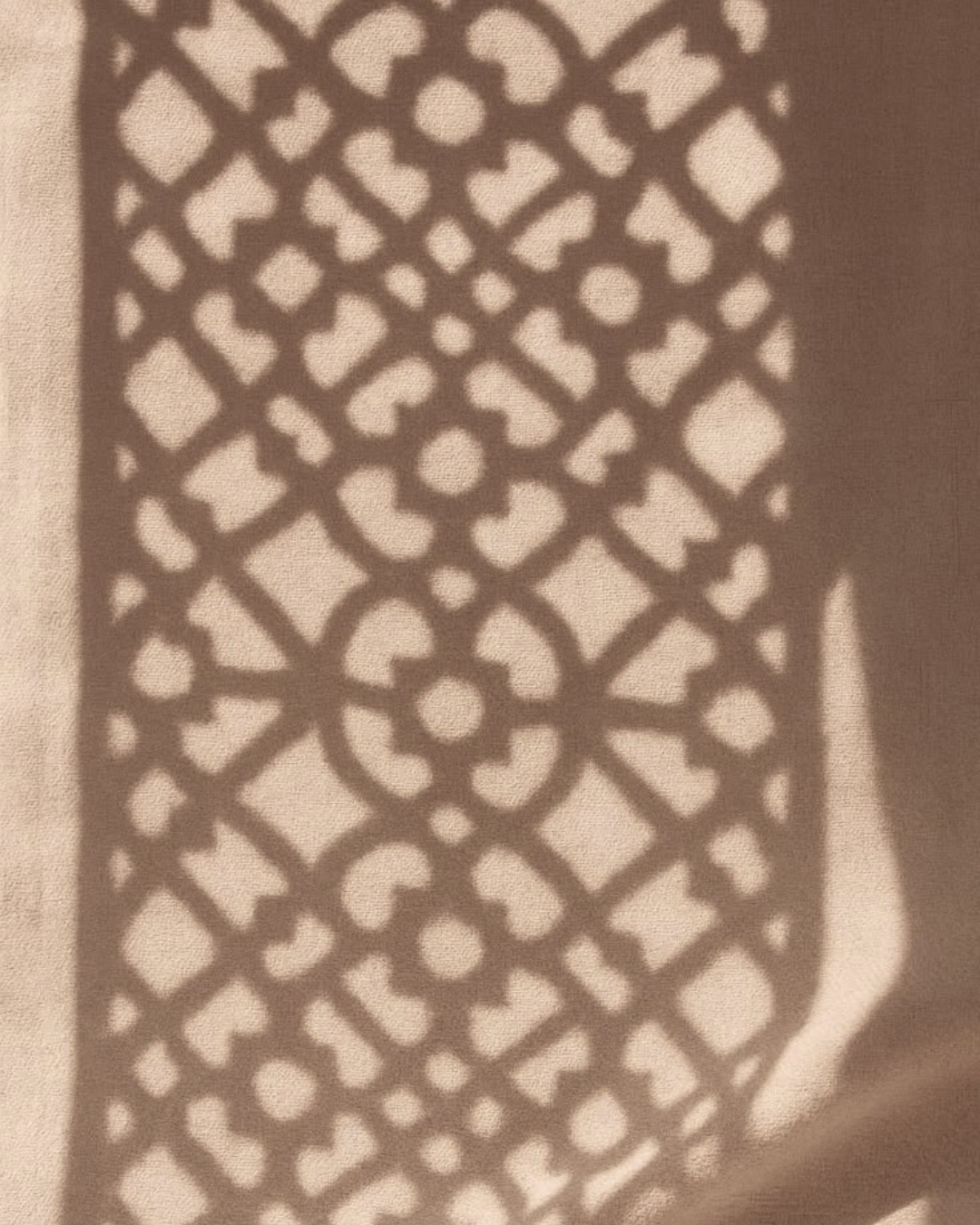
Beautyhof is a new beauty clinic in Noordwijkerhout. During the brand development phase, the lead designer asked me to develop an independent concept that reflected my own vision for the brand’s direction.
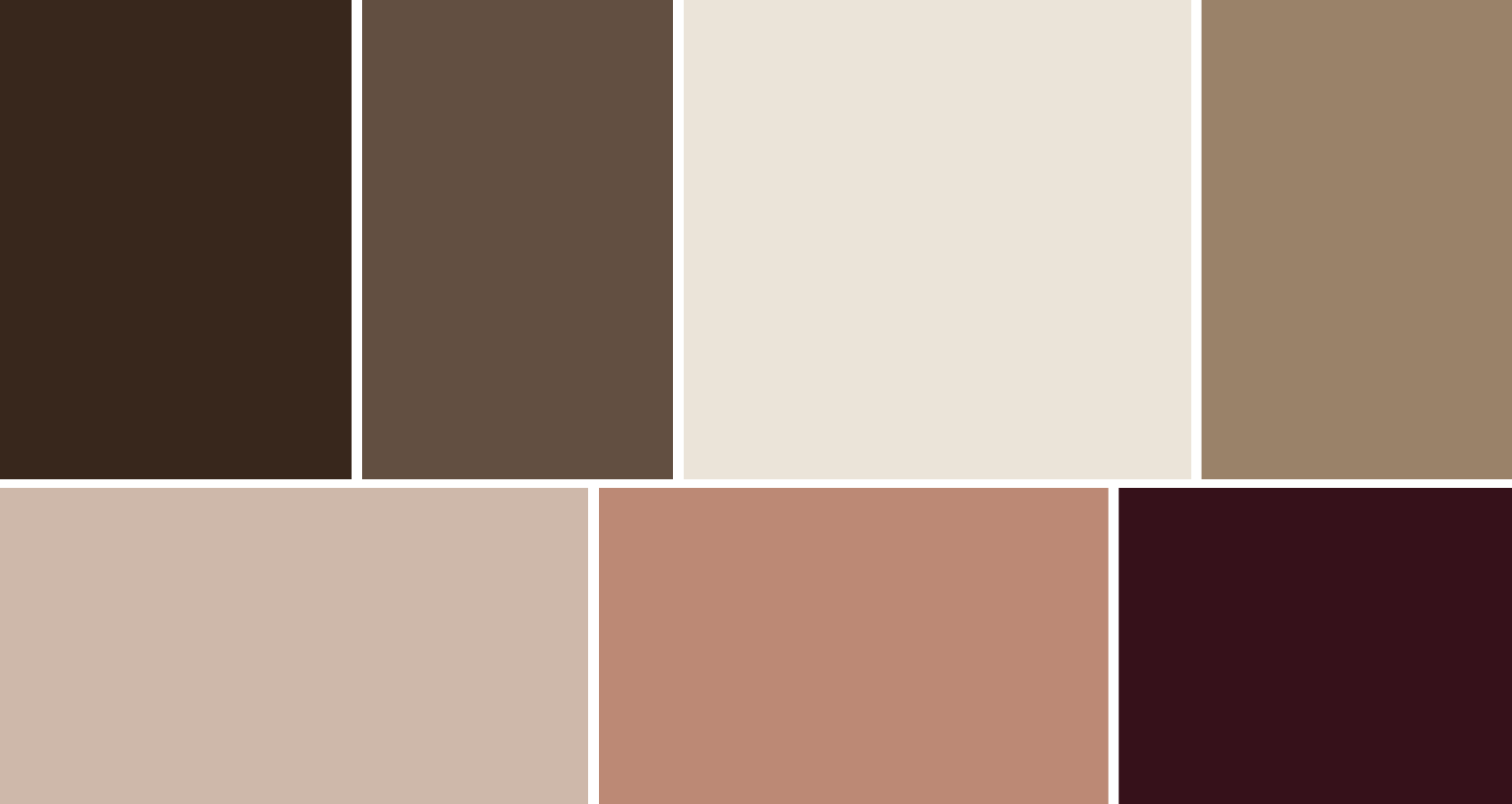
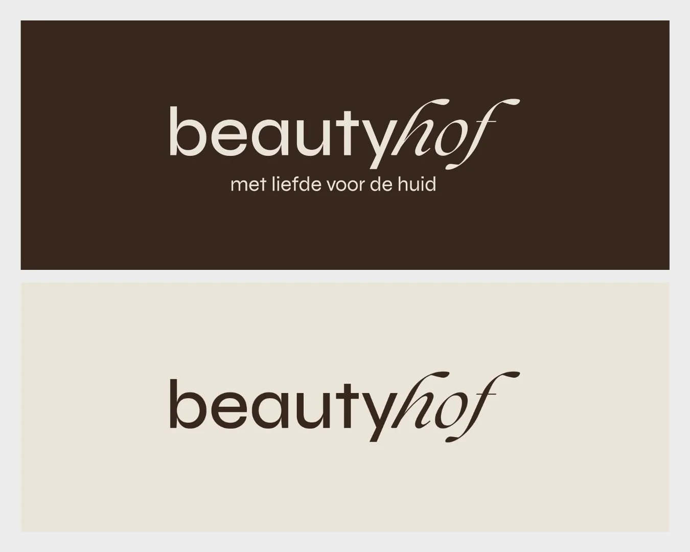
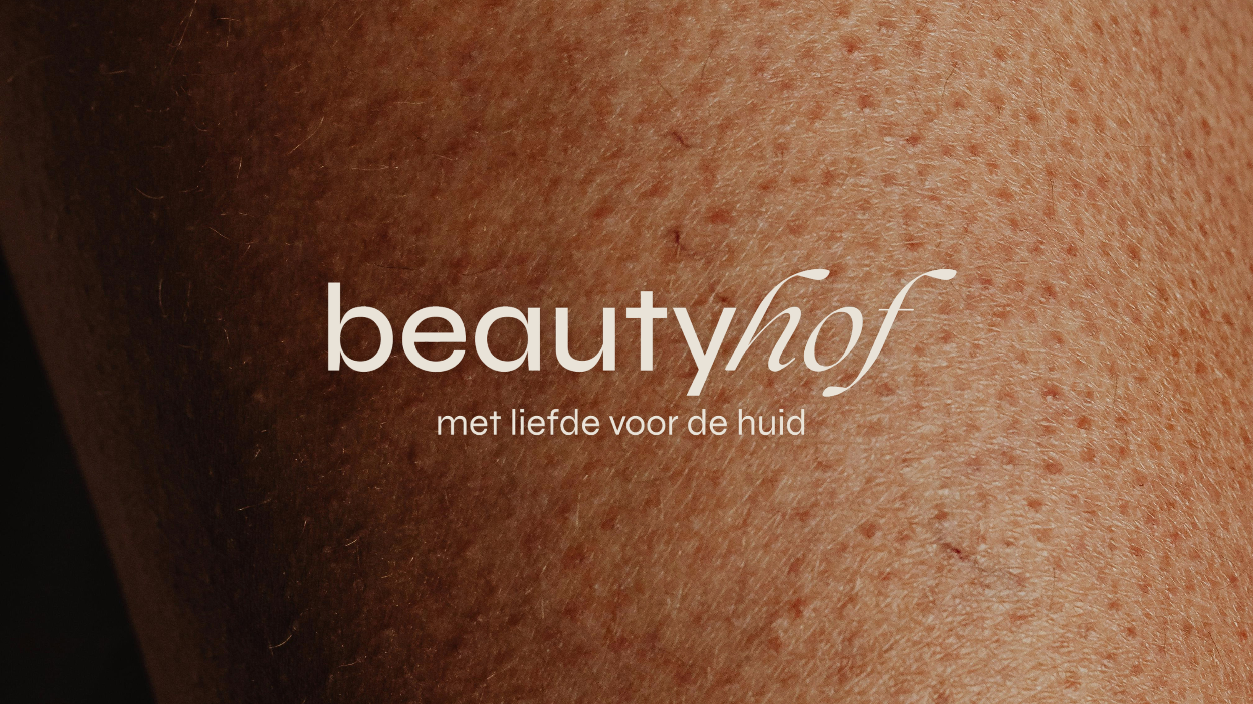
The lead designer’s original direction was soft and feminine, built around a serif typeface. Given the owner’s more down-to-earth nature, my brief was to explore an alternative. The result was a more unisex aesthetic, sans-serif typography and a deeper colour palette. The two concepts were then merged, most clearly visible in the final logo, which combines both serif and sans-serif typefaces into a single mark that reflects both perspectives.